I’ve been reflecting on how educational technology can help design students get better at seeing different opinions and expressing their own. Particularly in UX, it’s often difficult to know what aspect of a design might have the most impact on the users and business. This makes it important for future designers to understand how different stakeholders might be focused on different aspects of a design.
One of my favourite features in a classroom is the collection of different student opinions. Giving them time to understand their classmates’ perspectives and their reasoning can develop deeper creativity and critical thinking. This is also similar to the activity of disagreeing with stakeholders and negotiating how to build an interface that every senior UX designer can relate to.
So how are the tools we use to teach helping us creating higher quality conversations in the during class time?
There are activities like Think, Pair, Share that I absolutely love. Basically, you ask students a question then ask them to write down their answers in silence. Then you ask them to get into pairs, and share 1-on-1 with their partner what they learned. Finally, as an instructor you draw on the different pairs and ask them to relay back what each of their partners said or what they learned from their discussion.
This activity captures 3 critical components of learning brilliantly:
- Provides reflection time for each individual student to form an opinion
- Promotes critical thinking by exposing students to potentially diverse opinions
- Encourages metacognition when the students have to share back their learnings with the class
Despite my affinity for it, particularly in-person, it falls flat when you’re put in a pair with someone who:
- Shares a similar opinion or is in agreement with you, or
- Simply didn’t put in the effort on their own individual thought
More than that, the instructor is often blind to what ideas emerged across the entire group which hinders their ability to coordinate more impactful discourse.
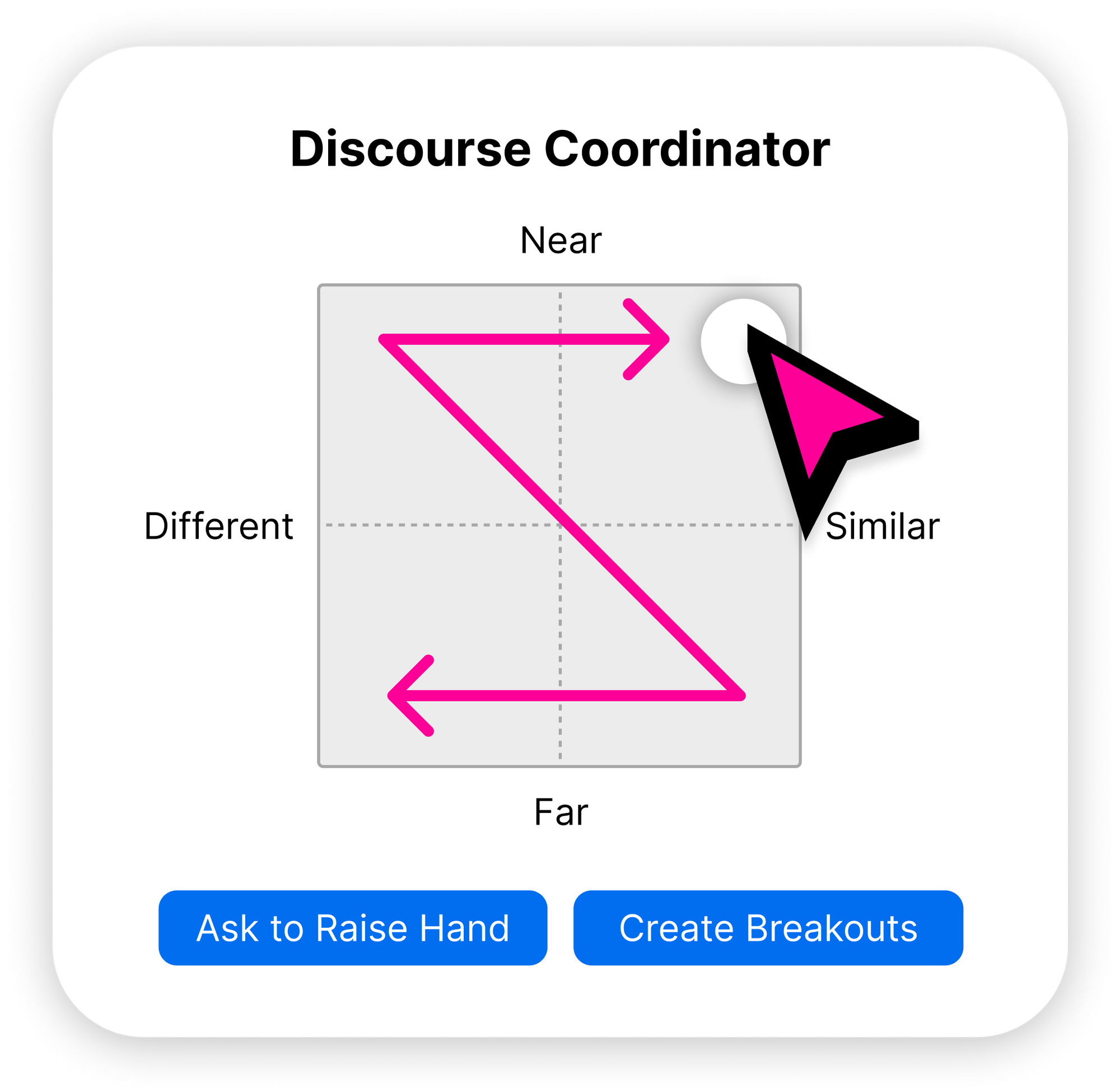
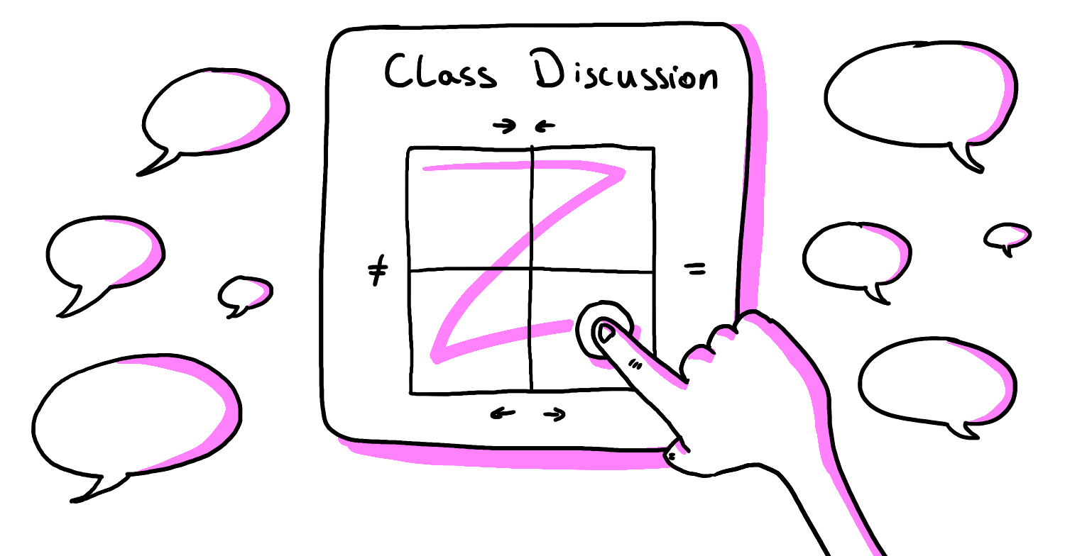
This led me to start exploring a UI for a “Discourse Coordinator” with a visual artefact, specifically for a future UX classroom. Check out the video demo of the “Discourse Coordinator” below so you can see it in action.
Think of it like the comment system in Figma but with some added controls for the instructor:
- Toggling comment visibility between individual and group
- Sentiment analysis across different areas beneficial for discussion
- Quick access for asking students to participate or go into breakout rooms
The three components could easily be integrated into any existing commenting system. Whether it’s in a tool like FigJam or Miro, there is a lot of room for tooling that makes instructors more impactful. Features like this would enable the instructor to get quick insights on facilitating discussions with much more intention.

The goal of this exploration is to see if by integrating tools like the “Discourse Coordinator” into our teaching, we can create richer, more intentional discussions that benefit everyone. I’d go so far as to say that we have too much focus on making things easier when it comes to EdTech, but I believe that people will put in the work if it means learning becomes more engaging. It’s a way to ensure that all student perspectives are not only heard and considered, but also sufficiently challenged to further their depth of thinking.
