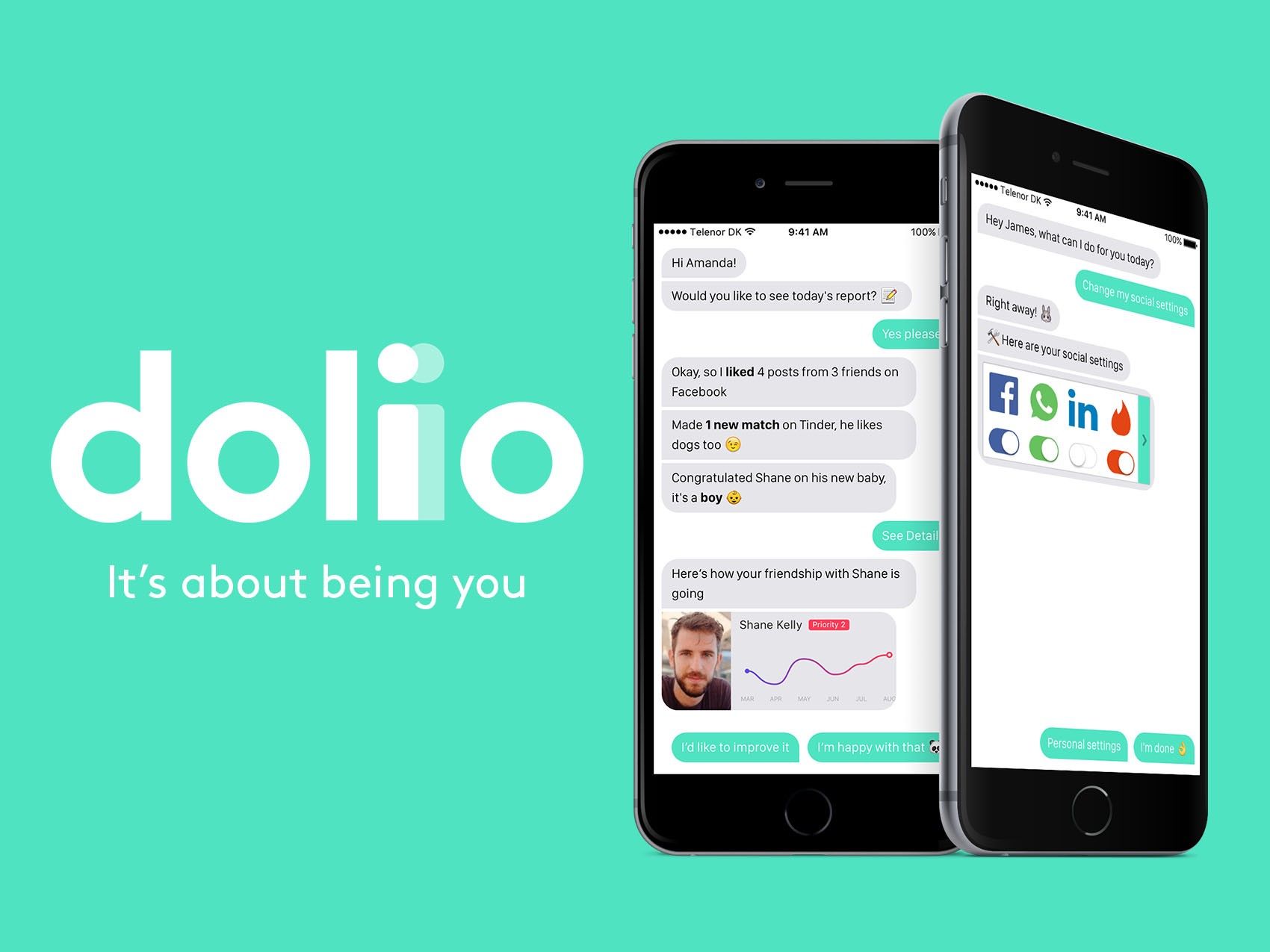
As designers who work with technology, part of our role is to explore the limits of what is possible and to have a point of view about the society in which we live.
In a world of networked systems and ubiquitous computing, life is being lived faster than ever before. Some of the human connection in life is being lost.
By creating a fake application called Doliio, we wanted to highlight the lack of personal connections and demonstrate how willing people are to abandon the responsibility of maintaining personal connections.
We launched the project with this “candid” video:
After gauging the reactions, we decided to then launch a full website and campaign around Doliio as an application that was in beta.
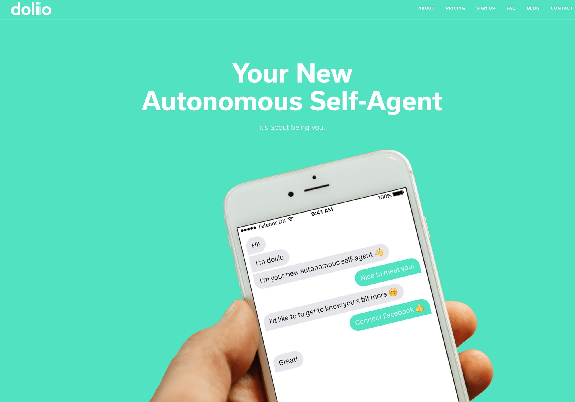
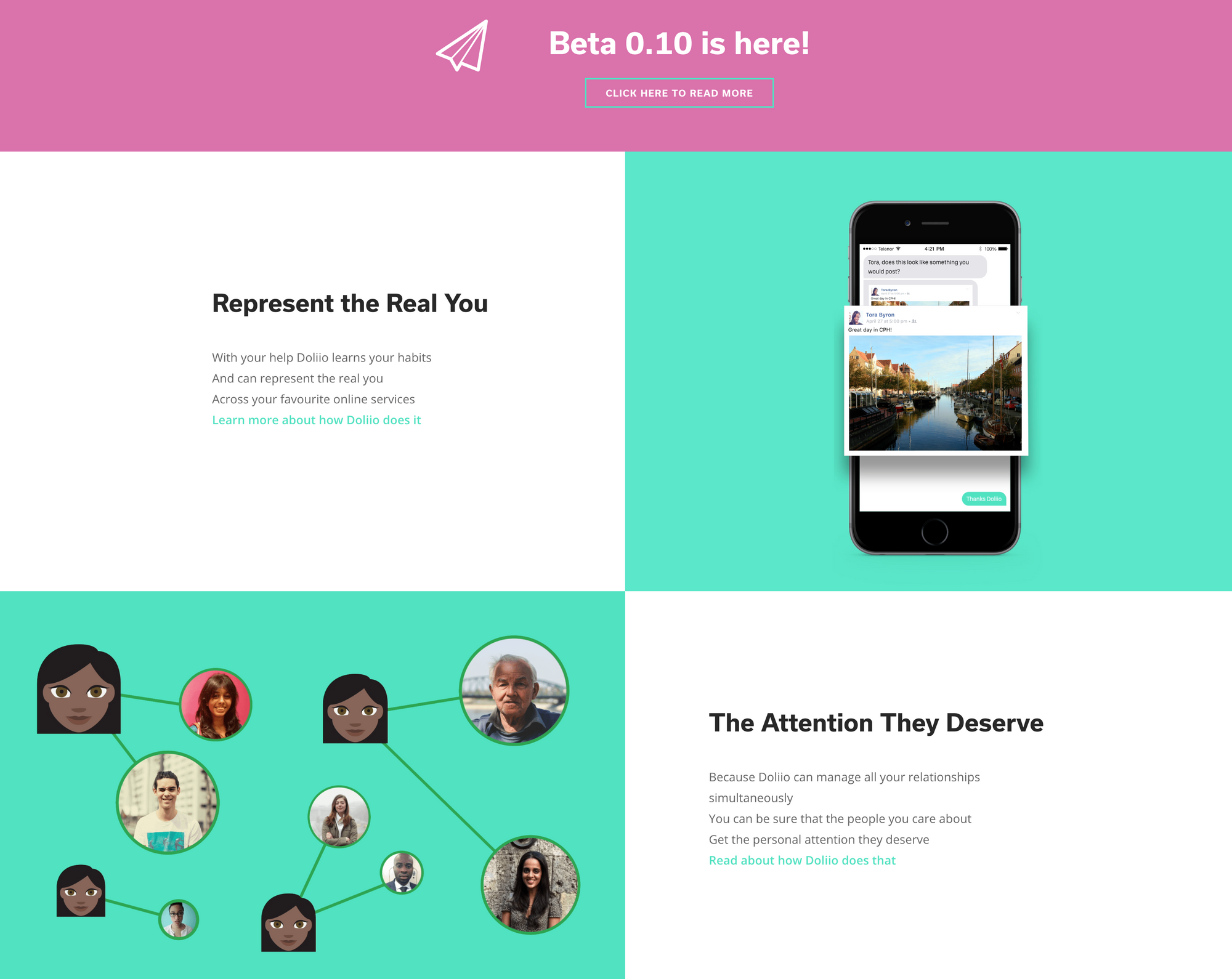
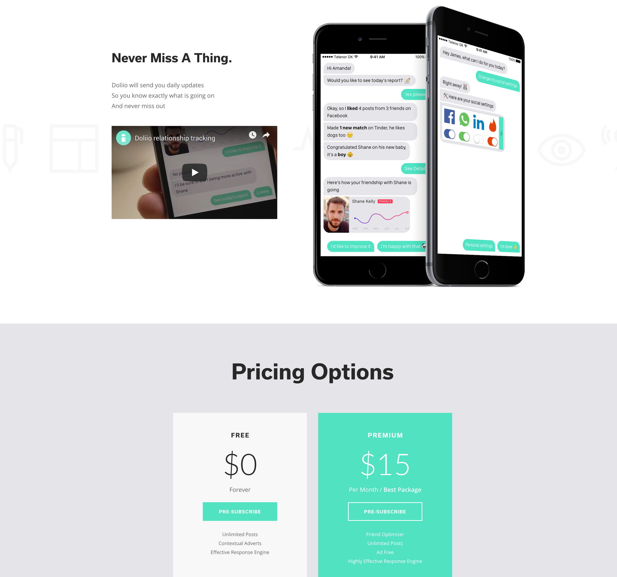
Along with the website we created a high quality launch video to generate hype and highlight the key features of what Doliio would be best used for.
Research, Testing & Reactions
It starts with unorthodox research
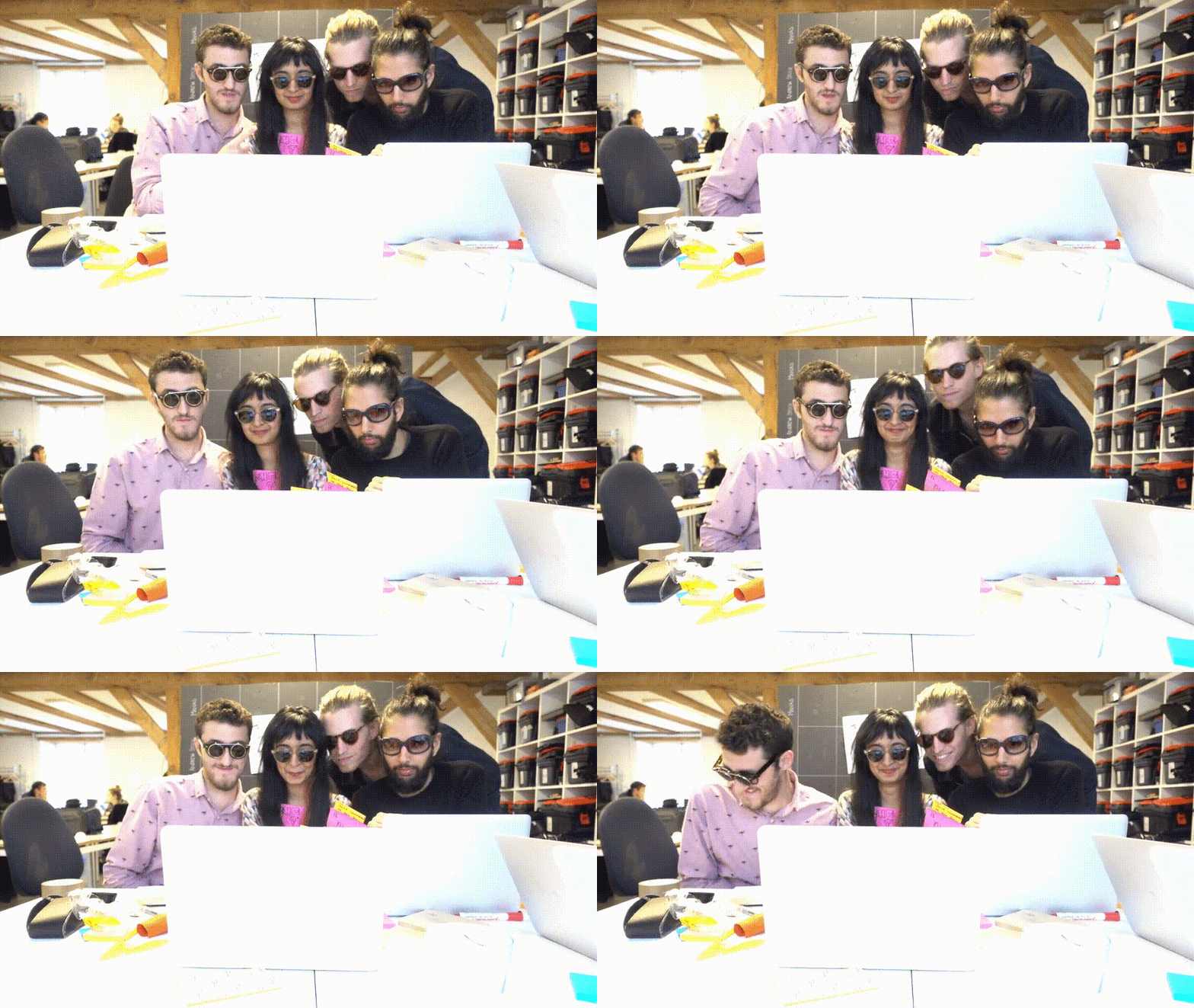
We were committed to ensuring that the project was being conducted in a way that was “futuristic”, in order to maintain that vibe whilst we were ideating about the best features to build into Doliio.
We built a graph of Creepy vs. Useful and plotted out a Line of Perfection (LOP), a Preferred and Acceptable Area of Perfection (PAOP + AAOP), and an Area of WTF (AOWTF) in the top left.
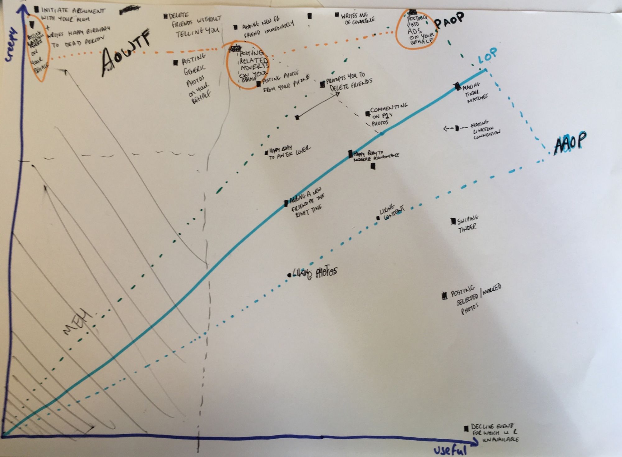
The graph was actually an invaluable tool for critical projects in general. We noticed that there is an observable movement from the top-left and then down the y-axis as time passes. Ideas for Doliio that were in any AOP were immediately implemented and as time would pass, ideas would reduce in creepiness and fall into the AOP. Too much time, and they exit the AOP and become either simply boring or useful and therefore, not critical enough to prove a point.
Finally when our ideas and prototype were complete, we went online and used chatbots, chatroulette and tinder to understand how bots are programmed today and source people who would be willing to try our prototype.

In-person testing
We were lucky to find people on Tinder, from our school network, and who had various backgrounds to test Doliio with.

These in-person tests and interviews revealed a lot of concerns but, to our surprise, a lot of willingness to use such a service.
One of the people we interviewed, Harvey, was quite enthusiastic about it and actually agreed to allow Doliio to control his online accounts for the duration of an entire weekend! Since he was a writer, he agreed to write an article about it following his experience and so we set about creating our first Doliio field test.
That was the point when we realized that Doliio might actually create some waves outside of the classroom.
Reactions and media coverage
After the launch of doli.io, Harvey’s blog post got picked up by Vice’s Motherboard and consequently shared across several channels.

This generated over 1,000 sign-ups to our newsletters and got us several requests for early access to the beta, as well as people asking us if they could work with us on Doliio.
Conclusions & Hindsight
Doliio was an extremely important project in my understanding of communications and design’s ability to shape the future, for better or for worse.
There were several things we got correct with Doliio, but we also had a lot of hiccups, particularly with our press coverage and management of reactions.
A lack of a proper schedule for the blog prevented us from following through with the ridiculous concepts we wanted to push as “updates” to the Doliio platform. We were also not prepared for such a big reception and as a result, we didn’t manage to respond to all the emails and media requests we received in a fashion that we would have liked. Those are some personal learnings that have stuck with me.
Overall, this was some of the most fun I’ve had on a project and the amount we learned from people about how they think about their relationships, both with each other and with technology, was invaluable.
