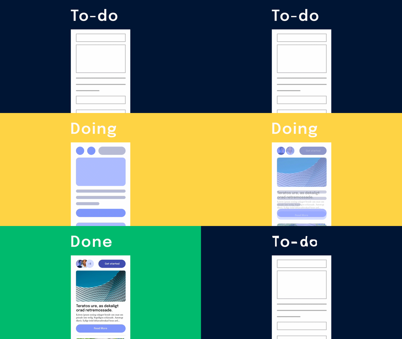
Modern design canvases, like Figma, take inspiration from sticky notes we put on a wall. As you add and move sticky notes, their purpose gets lost and additional information not on the note is lost. Similarly, the design canvas gets messy with frames filled with UI at different states of completion. These end up strewn around the space with no way of discerning what’s ready for production and what’s not.
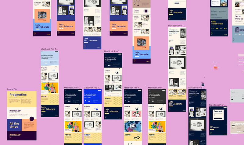
Current methods of organizing canvases inherited the limitations of physical space, and as a result don’t help to declutter the canvas. Like with paper, most people add labels on the canvas to show status and delineate space. They’ll create “In progress” or “Ready” labels that we add on top of frames to show readiness levels. This works if the canvas remains static, but that’s rarely the case. Move a frame and you have to carry the labels around with it. Even the brand new “Sections” that Figma released has some of these limitations since it’s a very strictly defined space that acts as a parent frame of sorts. Adding frames means more labels, which clutters the layer list with irrelevant objects.
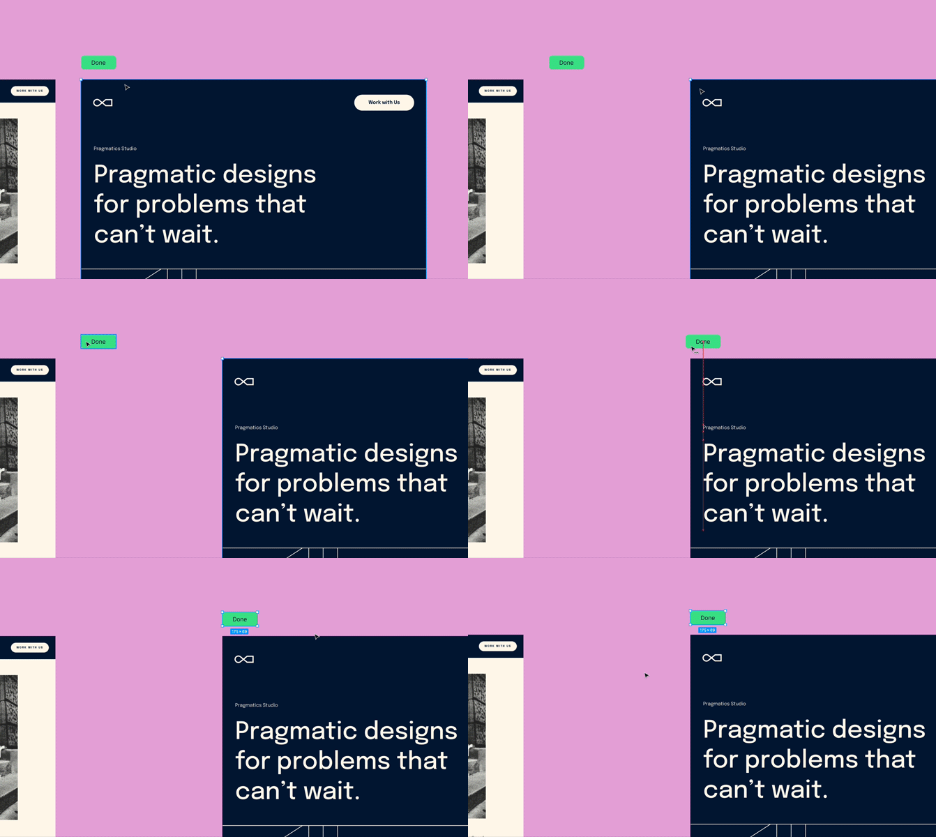
This was a great first step in the evolution of the infinite canvas as a design tool. But as they get used more by people in different roles, we’ll need better tools.
This is what we’re trying to achieve with FigDone. It’s a Figma plugin we released recently as an experiment in productivity. There were many plugins that added status labels on the canvas for you. Some even moved the stickers with a dedicated button in the plugin. But what they all lacked was the data layer to find those frames and update their statuses.
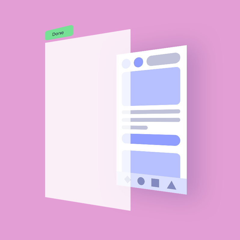
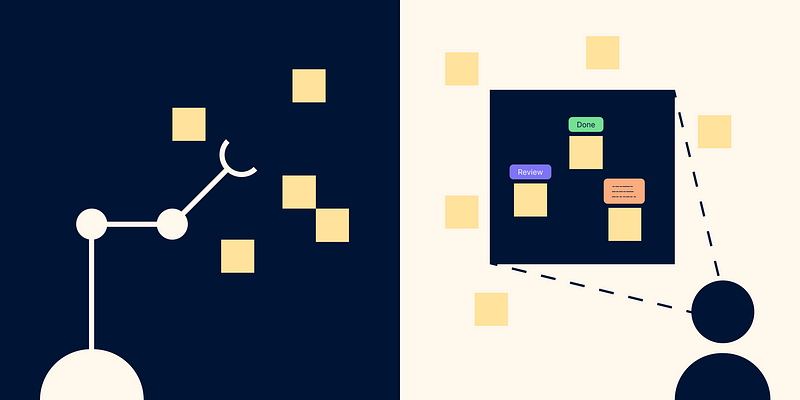
Those solutions gave you a label robot. It speeds things up but the visibility limitations of the physical wall were still there. You still had to remember where things were, and if someone moved a frame by mistake, it became impossible to find. Our idea was to replace the robot with augmented reality glasses. By looking at the wall, you can toggle information on and off as it suits you for the mode of work you’re doing.
Beyond toggling information, what if those labels we add to frames can be intrinsic properties of the frame? They would follow it around, and get out of the way when creative focus is necessary. With a simple click, you can summon all frames of a certain status then move or share from within the canvas itself. This would allow creative flow to blend seamlessly into productive output.
Currently, FigDone is a simple renaming tool with filters to speed up updating statuses. As more designers, product managers, and developers use it, we’re learning about their needs. This feedback will help us build the most fluid design management layer on top of the canvas.
Digital canvases have come a long way from their humble beginnings in 1963. We’re excited by their ability to accommodate many different workflows. As daily users, we want to play an active role in making them better for everyone. As our tools shape the way we work, we should shape them back to create the ideal environment for modern teams.
