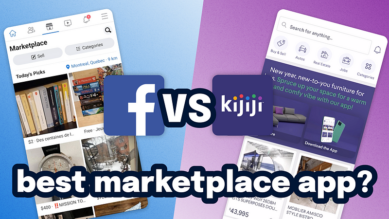
Improving marketplace UX means getting more users
You can improve marketplace UX with better search and helping users make offers. But the real secret?
Having more people 📈.
In our latest YouTube video, we did a UX comparison of Facebook Marketplace and Kijiji (a Canadian marketplace like Craigslist or eBay). Below we’ve summarized our learnings.
It’s a humbling reminder that design isn’t the determining factor for the success of many products.
Because marketplaces are all about finding the best items, the best way to build a strong experience is to improve the quality and quantity of what’s available.
That’s why Facebook Marketplace is dominating now with:
- Users that are more easily verified and trusted due to their social profiles
- More users in general and as a result more options for anything you search for
- UX nudges to make sending an offer fluid and easy (Check it out at 15min39s — link below)
Meanwhile Kijiji is looking increasingly dated and relying heavily on Wayfair ads to bolster the slowly shrinking list of search results. Today Kijiji looks like this:
- Confusing icons in the navigation both on top and bottom of the screen
- Large ad taking up screen space right off bat signalling that much more is to come
- Outdated search filters with too many unnecessary options
A nice bonus for Kijiji: listings are indexed on Google so users without an account can find them where they search for most things. However, without the large catalogue of stuff, it doesn’t mean much, especially since people naturally go to FB Marketplace first.
