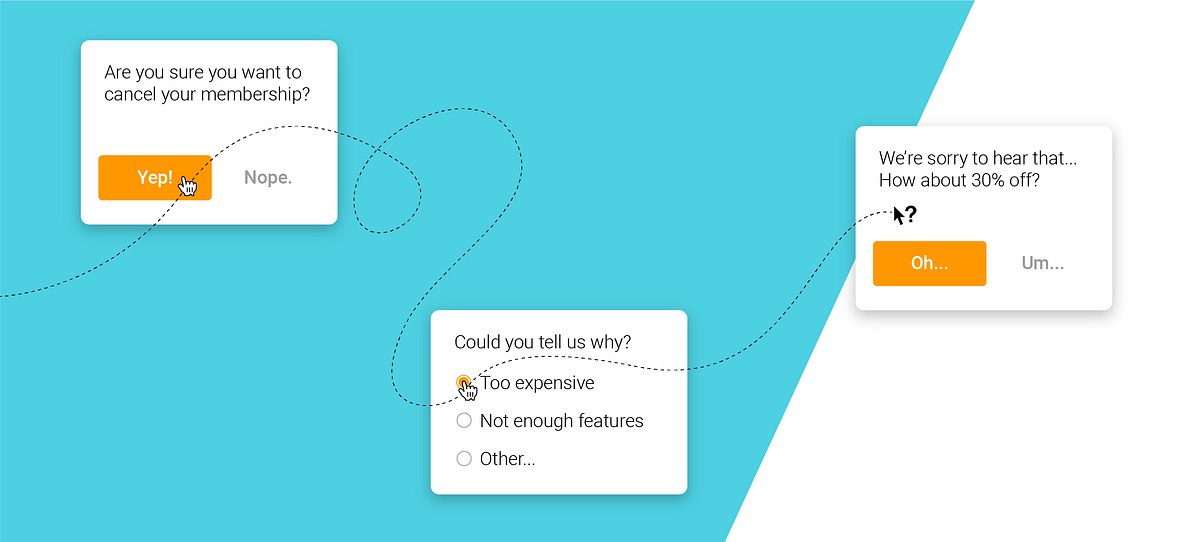
Recently I attempted to cancel an Audible membership that renewed automatically after a free trial. Before online subscriptions, the process of cancelling a service will usually involve a call centre, getting asked some some questions by the customer support team, then being transferred to the accounts or sales department. At this point a more savvy employee will find a way to keep you on, usually by offering you extra services or discounts that are often enough to keep you on until the next time something irritates or you notice a better deal elsewhere.
These offers work because customers rely on their emotional experiences with salespeople more than any of the traditional factors, according to research by the Peppers & Rogers Group, which showed that:
- 60% of all customers stop dealing with a company because of what they perceive as indifference on the part of salespeople
- 70% of customers leave a company because of poor service, which is usually attributed to a salesperson
- 80% of defecting customers describe themselves as “satisfied” or “very satisfied” just before they leave, and
- Customers who feel their salespeople are exceptional are 10 to 15 times more likely to remain loyal.
Today it’s becoming less common to see such offers happen because so many of our services have moved online. This is where my experience with Audible flips that formula on its head. They convinced me to remain a customer through clever and subtle tactics in the UX of their cancellation, mimicking the most important attribute of a good salesperson: Negotiation. In this case, we’ll be looking at price negotiation specifically as that was my problem with the service.
Anticipating the cancellation before it even happens
Starting from the membership details page in my account settings, before I’ve even started to cancel my account, three important details begin dissuading me from proceeding:
- Subtle placement of the cancellation link outside the membership details box
- A list reminding me about my membership benefits
- Thank you text with the original subscription date
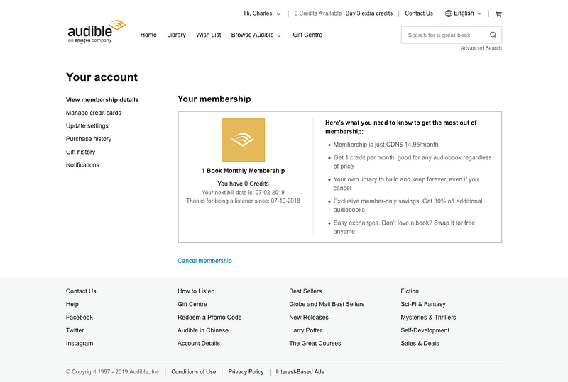
These small details make the user feel appreciated while simultaneously reminding them about how lucky they are to have this service. Audible knows that a customer is likely navigating to their membership details page in order to cancel and the UX team is preemptively addressing this. Amazon, Audible’s parent company, proves their mastery of using such tactics by employing similar designs on their own Prime membership screen:
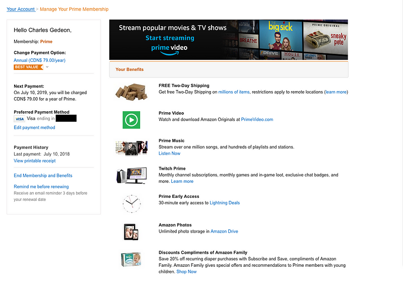
In contrast notice how neither Spotify nor Netflix, the two biggest online streaming services out there with the most comparable business models and users to Audible, are doing anything similar. Instead their membership and subscription pages feel dry and utilitarian:
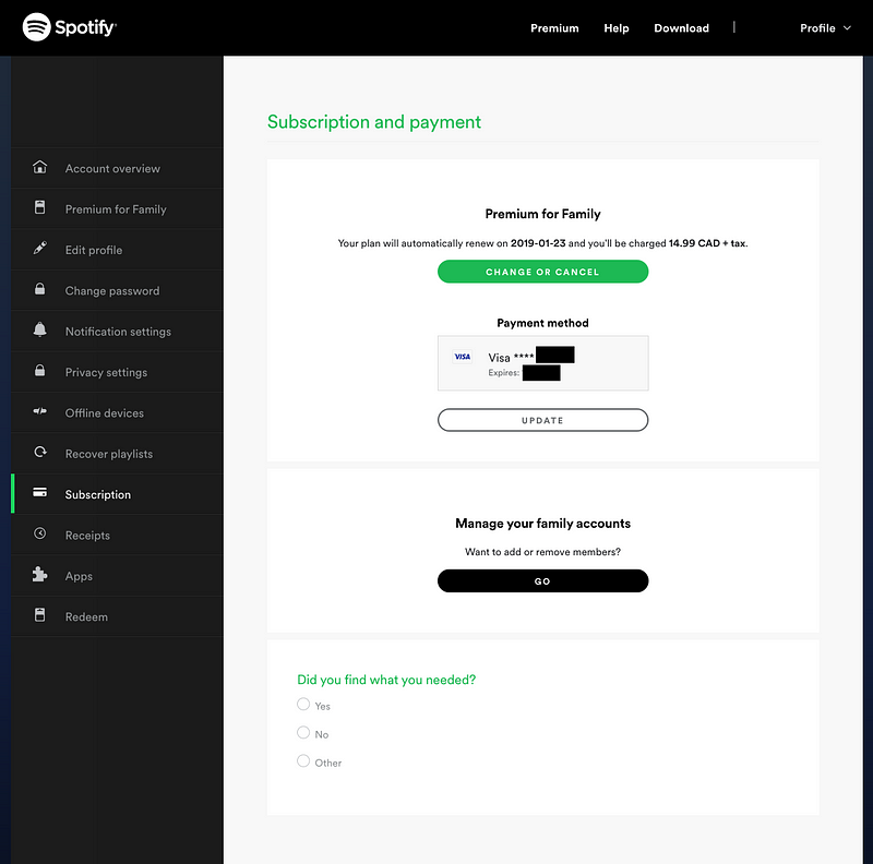
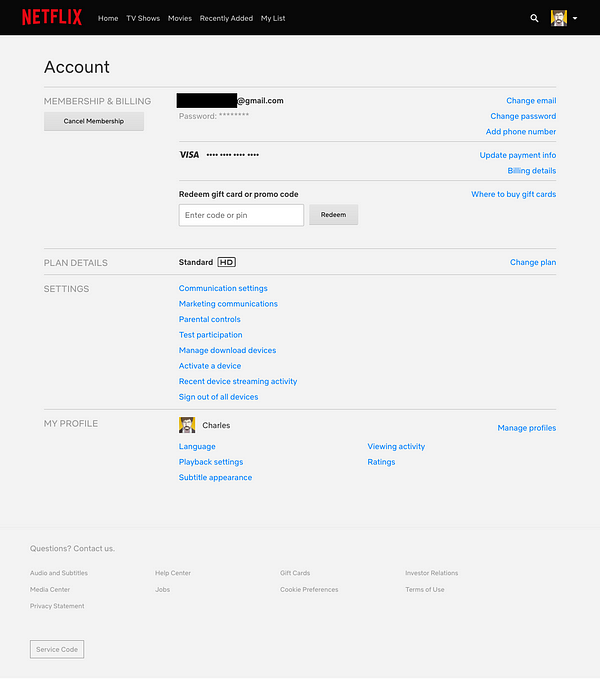
In fact they have attributes that are the exact opposite of Audible:
- Chunky buttons to cancel accounts
- No reminders about any benefits
- Absence of thanking the user with the date of when they signed up
While the first point could be seen as more user-friendly, what Audible is doing is not nefarious. On both the Audible and Amazon Prime membership pages, the text for cancelling follows the general button-less user interface and appears where users can expect it. It simply isn’t the focus of those pages as Audible and Amazon are trying to show the user that perhaps they don’t really want to quit.
Truly user-hostile interfaces — dark patterns as Harry Brignull calls them — are ones that deliberately confuse the customer away from what they intended. He demonstrates this through an example of deplorable opt-out trickery from the old Ryanair site:
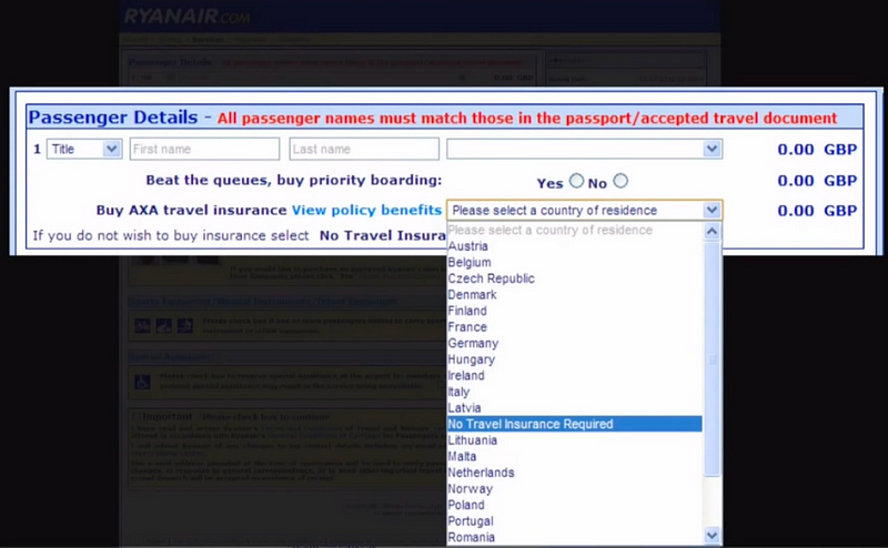
The second nudge Audible uses to keep its users from cancelling are the reminders about what they get from a membership. Reminding users of the benefits might seem obvious yet, as we saw above, neither Netflix or Spotify seem to consider it useful. Strangely, few services seem to use this unobtrusive trick.
Finally they thank you for being a listener and remind you about the date you joined. There’s a shocking stat about the power of this little “member since” detail on American Express cards:
The $100 million estimate comes from the excellent lecture below by Rory Sutherland, Vice Chairman of Ogilvy & Mather, at 27:35.
Profiles containing “Member since” has become a little more common recently. One of the most aggressive implementations of it is seen on Medium, flaunting it on every article the users publish.
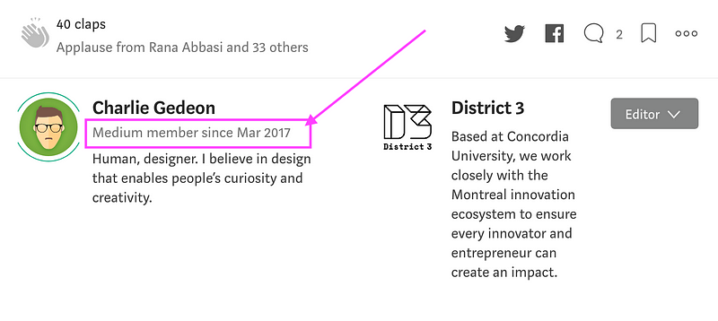
It’s unclear if the benefits of this help digital services a much as it does American Express, but from my experience alone it seems like it does. I know that I feel guilty every time I consider whether or not I’d like to keep my Medium membership.
For now I’m still ready to cancel Audible, so I hit the little blue link and proceed to the next step.
 </f
</figure>
Initiating the cancellation
After clicking on Cancel Membership, Audible takes me to a screen where they tell me that I’ll lose my benefits, which includes 1 credit that I didn’t spend and access to “Channels” (Audio Shows in Canada). Frankly I didn’t care at all about the latter, but I immediately left the cancellation flow to redeem my last credit before I continued cancelling. This is already significantly reducing the chance of a customer from leaving, as they may like the book they spend the credit on and change their mind. It’s made more powerful with the customized recommendations, supposedly “just for me”. Using historical data shows that I’ve already invested some effort into being a user and remind me of this makes it feel like I’m throwing away my “progress”.
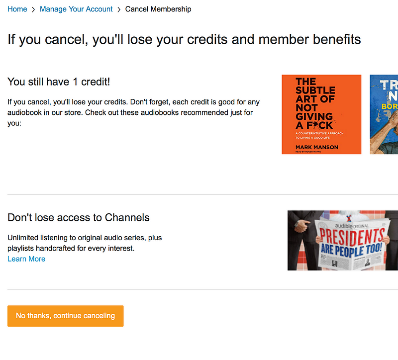
Compared with what Amazon is doing, Audible’s is still more personalized and likely to keep my attention. Below is the generic screen that every Prime member gets when they decide to cancel:
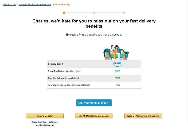
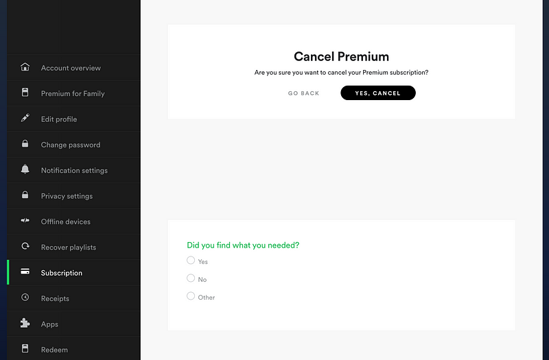
Of course this is miles beyond the sorry state of the Spotify confirmation screen which almost seems happy to see me go. I even showed this to a student in my class and they came to the same conclusion:
Back to Audible, I clicked on “No thanks, continue cancelling” and arrived at a form.

Understanding the user’s frustration
Anyone that’s signed up to a newsletter or web service in the last five years is very familiar with the “Why are you leaving?” form. Some companies might ask this once the deed is done, like the option in Mailchimp’s newsletters:
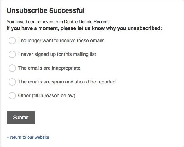
Audible asks this form before they let you go. I personally wanted to cancel because it’s too expensive so I chose accordingly:
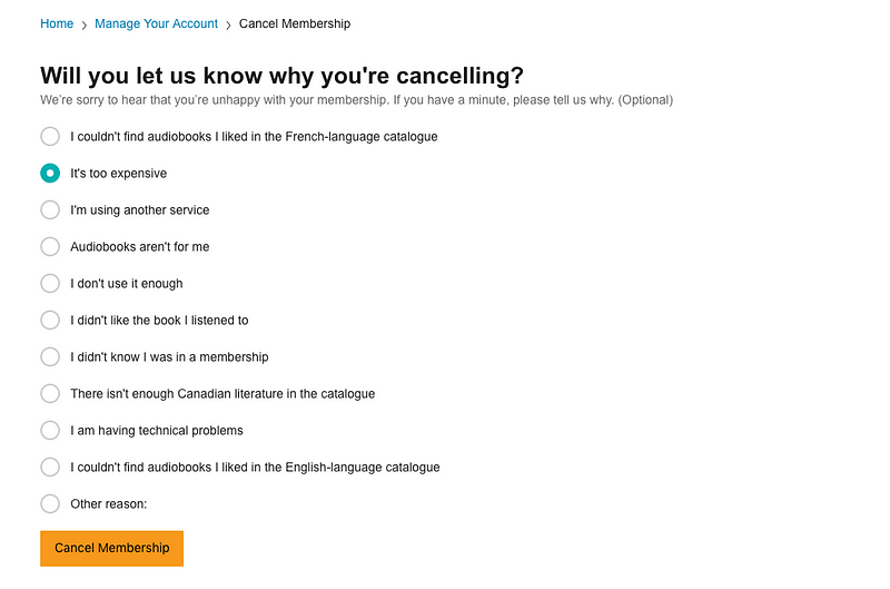
Putting the feedback form before the cancellation is essential in order to serve the user one of the most potent tools in a salesperson’s arsenal: the freedom to make special counter-offers.

The climax of a negotiation: Making a counter-offer
Look at the screen below and notice the different offers being made. The ability to get a discount seems to be exclusive to this screen of the process, as well as the ability to pause.
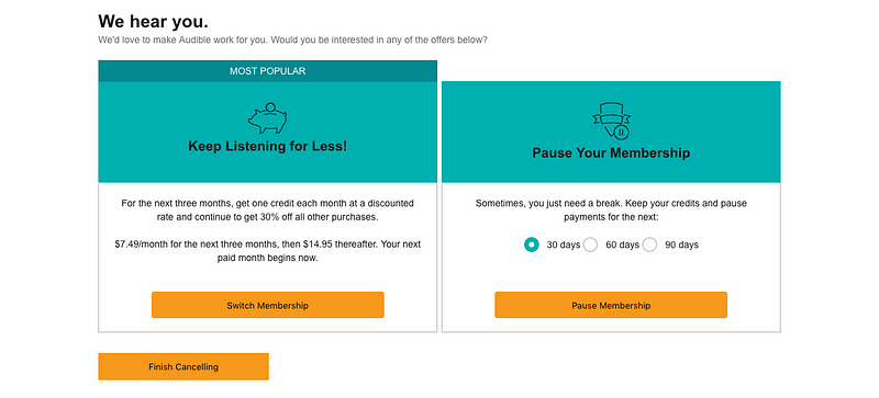
The brilliant thing about this is how easy it is to implement. No complex AI, just a simple flowchart:
If they select this option, then offer that discount
This simple mechanic plays right into highly complex cognitive feelings in the user of getting something exclusive. Recall the stat from the Peppers & Rogers Group study:
60% of all customers stop dealing with a company because of what they perceive as indifference on the part of salespeople
Netflix also offers a type of counter-offer. After confirming a cancellation, the option to either continue or downgrade to a cheaper option is provided:
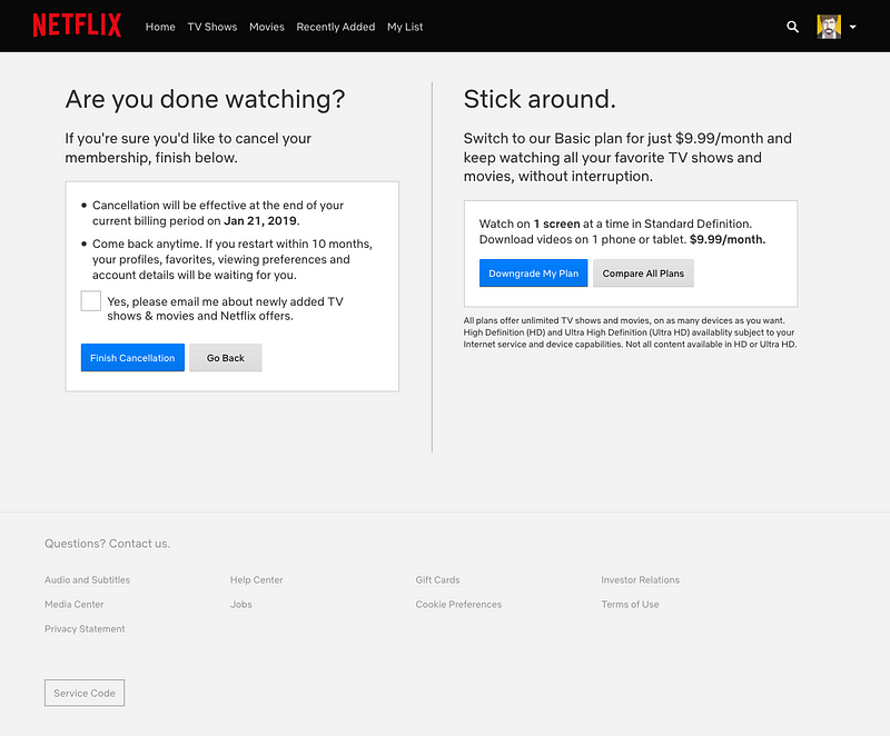
Without asking why, however, Netflix will not know the reason a user has decided to cancel and therefore won’t be able to offer targeted counter-offers. Even if the cheaper option is chosen, it’s not necessarily the price that was the motivator. It could be that users want HD on only one screen and are willing to let go of having two simultaneous active screens. It’s still better than the indifference shown in the Spotify cancellation but not nearly as comprehensive as Audible’s.
Continuing with the Audible cancellation, they convinced me to stay and I selected a 90-day pause and clicked on.

Post-offer state
Now that they’ve succeeded in pushing back my cancellation for another 90-days, I’m back at my membership screen. Waiting for me is a note that my membership is paused with that powerful “Thank you […] since” message. The benefit reminders also remain, except this time with a new call-to-action button prompting me to resume my membership:
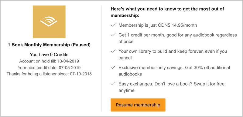
It’ll be interesting to see how I react in 90-days if I forget to cancel as it’s unlikely they’re going to remind me about it before it starts. For the perceptive amongst you, you may have noticed that Amazon is experimenting with that trick on their own Prime cancellation screen:
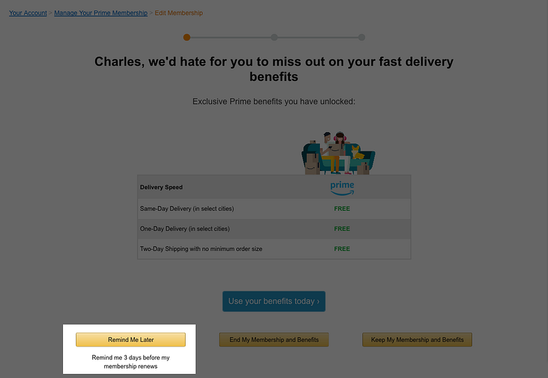
Whether or not I stay after that, Audible will at least have tried to understand my issues and negotiate with me. Currently I feel like I have a little secret that other Audible members may not know about and in 90-days I may give it another try. There is definitely no sense of indifference to my status as a member, and so I will think about whether I want to cancel later.
The fact that they were able to get me to reconsider before I cancelled is far more effective that trying to get me back after I’ve left.
Does this mean that you should adapt this user flow to your product?
As with all things in UX, it’s tricky to know for certain whether one company’s trick will work for you. Creating an optimal experience for your users is always at the intersection of your company ethos, your internal capabilities (both finances and resources), and your users’ well-being.
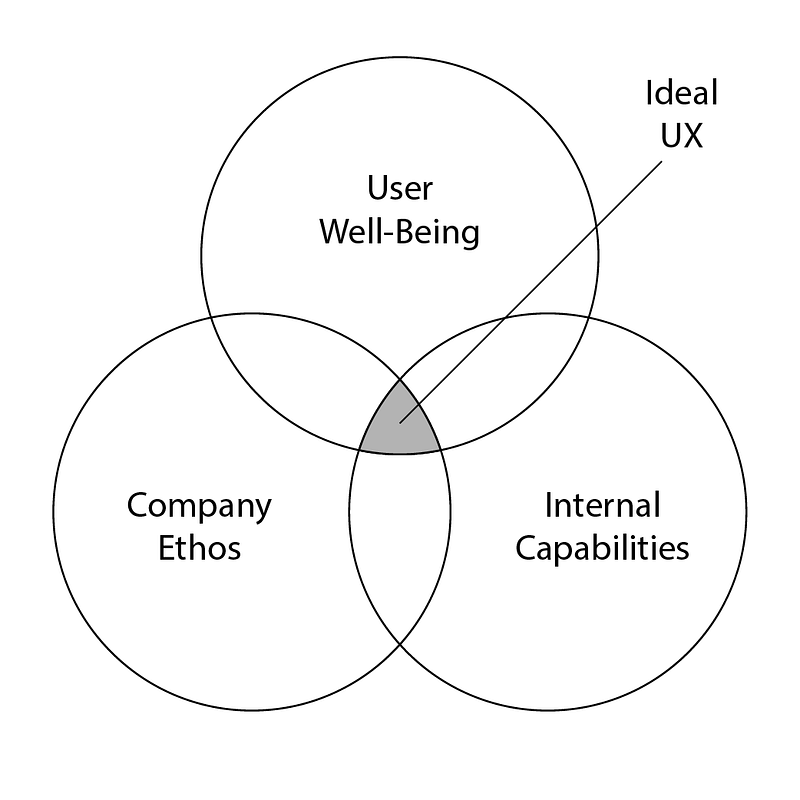
In the case of Spotify, perhaps they value a “no questions asked” approach to memberships and cancellations. It could also be that they have so many users signing up that it’s simply not worth it to dedicate resources to a more thorough cancellation process. Considering the push Audible is doing, it’s likely that they have some difficulties getting and keeping customers so investing time and effort into cancellations makes business sense.
Being at the intersection of those three areas is an ideal situation that doesn’t always present itself in practice. More often than not, you’ll be shifting around the different areas based on current business goals, leadership approaches, and market forces.
Ask yourself and your team some questions when designing the cancellation flow:
- What issues are pushing most of our users to cancel and how can we address those during cancellation?
- What parts of our service are most important for users to stay loyal and can we afford to change things on a per-customer basis in order to reduce churn?
- What are our internal company values and how can we reflect them clearly in the crucial parts of our cancellation processes?
By answering these questions, you can get closer to not only reducing your churn but improving your overall experience so that hopefully your users won’t have to resort to seeing your cancellation flow.
If you’d like to continue doing some research on how to keep your customers from cancelling, below are three articles I referred to when writing this:

Note: The author has never done any formal work with or for Amazon.
