A local listings management platform that helps businesses get the full view of their listings coverage across the most important directories, and syndicate their location content in real-time.
Overview
Problem: The platform was being supported by a large amount of manual labor and needed an upgrade to a more automated, self-serve product.
Users & audience: Account managers in small agencies that helped multiple local businesses, brand managers in large corporations with multiple retail outlets.
Role: UX/UI designer
Scope & constraints: Keeping the clients satisfied with the quality of the service while we migrate and train them to a new platform with a limited number of account managers.
Process
The company wanted to integrate all the reporting and analytics features directly in to the platform so it could finally become fully self-serve. This would help SweetIQ scale the business and drastically reduce the load on our accounts team so they can focus on delivering customer support and building relationships with clients.
Our research started with a thorough audit of the activities the accounts team did at SweetIQ and qualitative interviews with some of our most engaged clients.
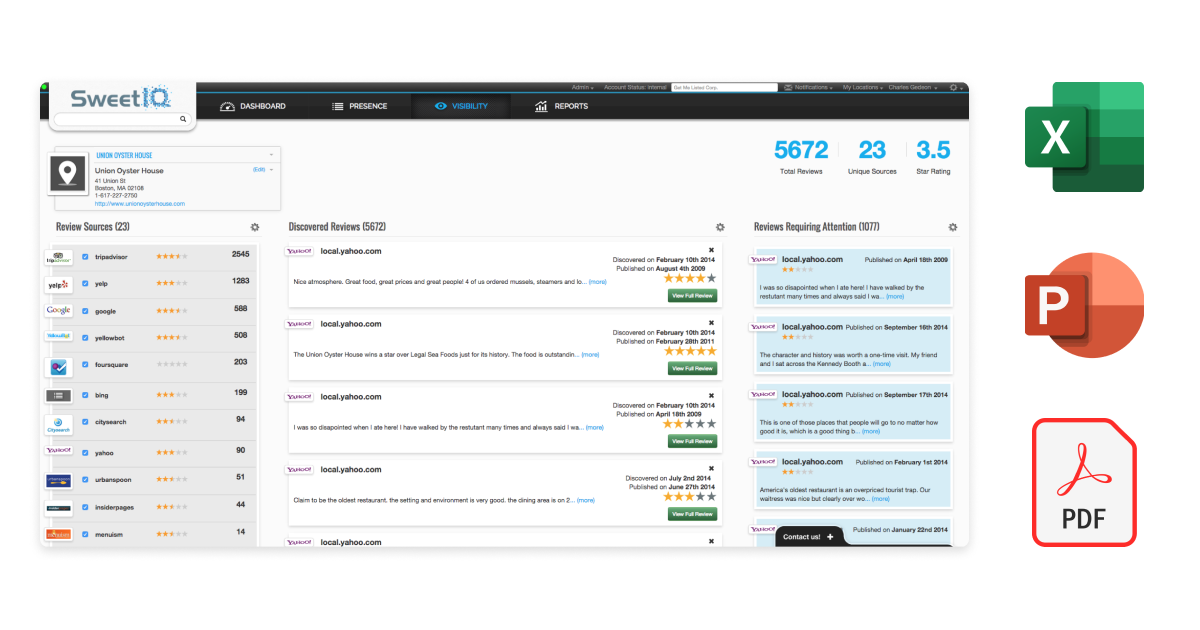
The original platform was a simple database of all the different locations that a retail business is managing. Clients had to manually generate reports by downloading CSV files and PDFs from the system. They also had to request reports from our accounts team that were delivered in the form of slide decks.

We learned about what reports were most useful to our clients, what the biggest painpoints in the current system were, and what other platforms they enjoyed using.
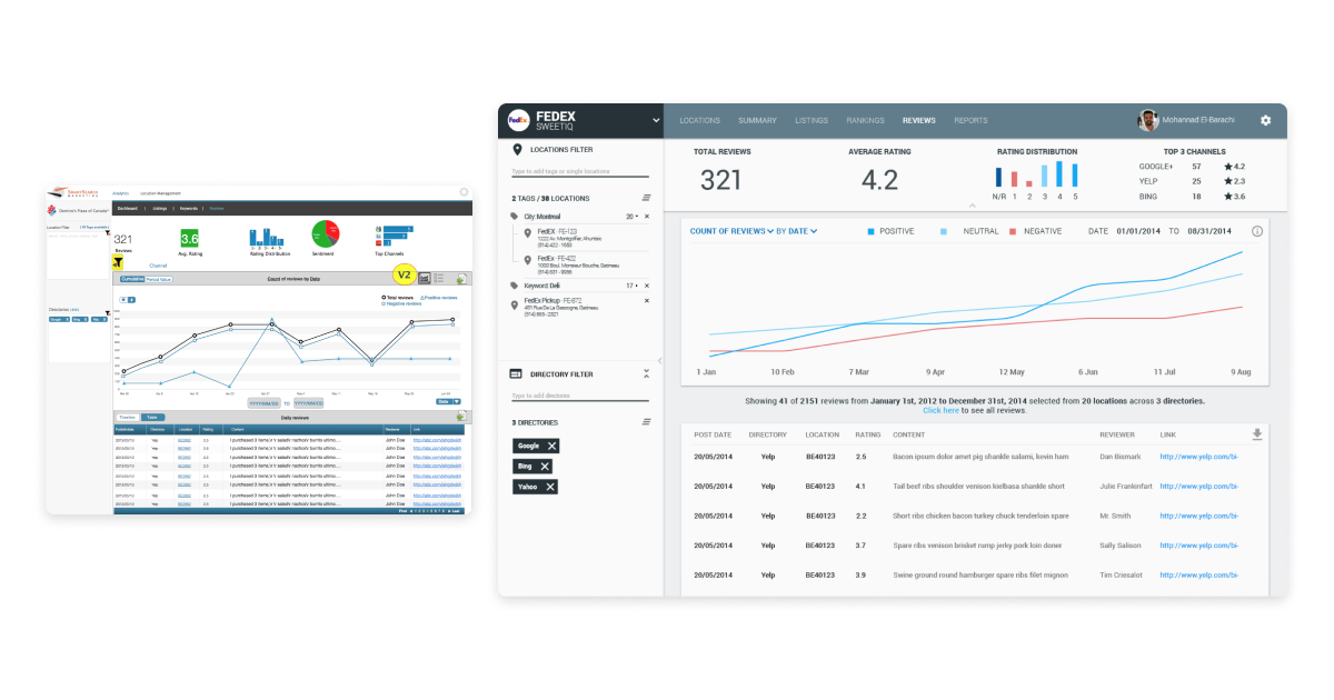
This helped us inform our ideation and resulted in a variety of different interfaces that introduced new graphs, visualisations, and table views to help clients understand and manage the large amount of data. Due to our small team at the time, we had to carefully assess the capacity to build features that would only add nominal value. The following prototypes were the ones that struck the right balance with both our clients and our dev team.

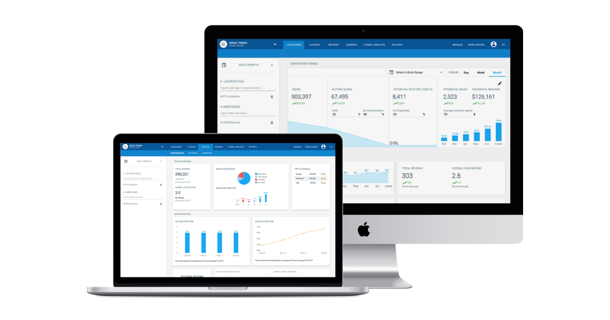
The final designs below not only alleviated the problems with the existing platform, they also introduced a new conversion funnel that helped differentiate the SweetIQ offering. The update was launched gradually, starting with our smaller clients and eventually completely replaced the old platform.

Results
- Eliminated report generation of the accounts team by 90%
- Reduced onboarding time of new clients by 60%
- Enabled massive growth resulting in one of the city’s largest startup exits
