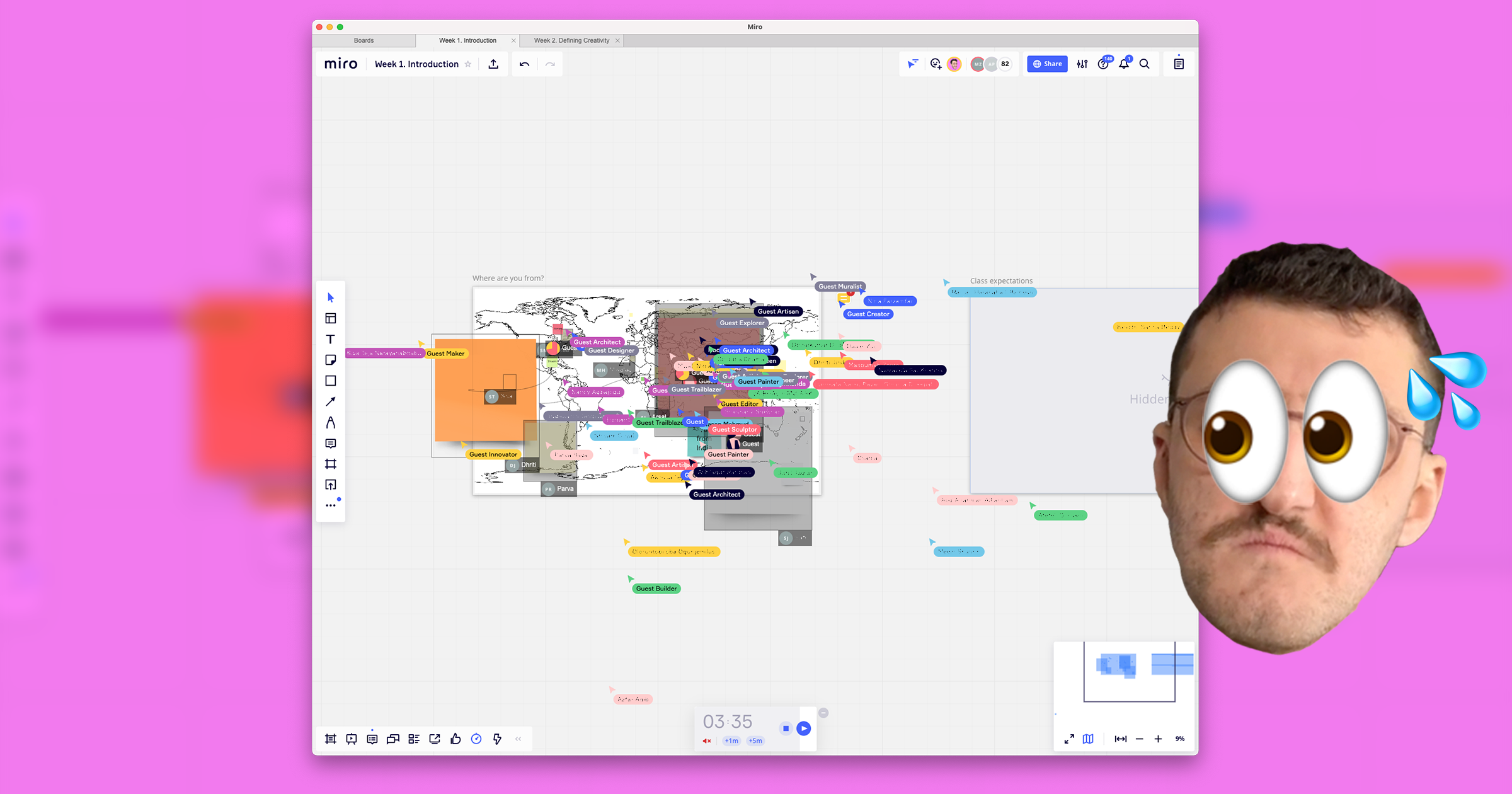
When I give a workshop in person, I don’t have to worry about whether people are familiar with the tools. Participants can focus on the activity, as the cognitive load required to use markers, Post-its, and whiteboards is minimal. These tools have clear affordances and exist in a shared space where the laws of physics apply to everyone.
In a virtual workshop, this isn’t the case. Participants need to be both tech savvy and familiar with the latest version of the specific application. With each new app, they must relearn how to generate virtual sticky notes and figure out how to navigate the shapeless virtual space. What’s more, many apps designed for workshops further disorient users by putting their own spin on each tool’s features.
For example, in an app called Miro, the sticky note is resizable but doesn’t include the author’s name. In another app called FigJam, the sticky note has an author but isn’t resizable. This means users have to form a different mental model of the sticky note’s purpose on each app, despite the tool having the same name.
Finally, unlike physical spaces, virtual spaces lack a shared sense of orientation. Viewers can zoom in and out of the whiteboard independently and might have different screen sizes. This robs participants of the reassurance that their work is being seen in the intended way.
As an instructor, I have to take all of this into consideration while designing my workshops. It’s an unrewarding chore that distracts from my real goal: to enable my students’ to learn. I’m both excited and apprehensive to see what will be possible with these apps once people get used to them. On the one hand, this technology will create new possibilities for large-scale, at-home learning. On the other hand, I can’t help but reflect on the fact that I’ve returned to paper to-do lists and journals after years of trying every app on the market.

