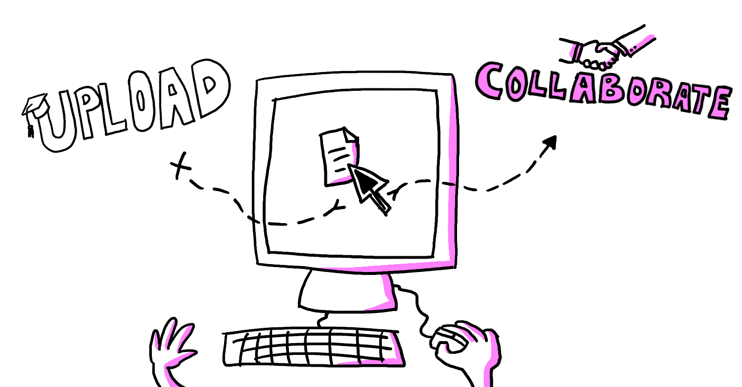
One of the biggest changes I made to my UX course last year was asking students to submit their assignments directly in Figma by a set deadline. Over the last seven years of teaching, I’ve become increasingly aware of what impacts students’ engagement and how instructors can pull on different behavioral and cognitive levers to deepen learning. It’s a shift in my thinking towards creating more interactive, work-like experiences in educational settings.
The traditional approach to assignment submission presented several challenges. Previously, students would work privately on their projects, using whatever tools they preferred, and then upload their work to Moodle. I would grade them and provide feedback, also through Moodle. Any follow-up questions or clarifications would take place via email, in-class discussions, or during office hours. While this process worked logistically, it created barriers to learning. Students’ ability to iterate on feedback was limited, sharing lessons between students was cumbersome, and there was no way to trace check-ins or feedback exchanges that occurred prior to submission.
On top of that, the system didn’t mimic real-world workflows that UX/UI designers use in their actual jobs. In professional settings, designers often collaborate within shared environments like Figma, where feedback is continuous and integrated into the work. There’s no such thing as submitting a project once and waiting for a final review.
So, I decided to make Figma central to my teaching approach. By introducing Figma as a collaborative design tool and learning space, students could work in shared projects, making the entire design process transparent. Rather than submitting assignments privately through Moodle, students now submit directly in Figma. Each student has their own space, that’s set to Viewer access for the whole class, which encourages peer learning and cross-pollination of ideas. This allows students to see how others are progressing, which can spark inspiration or raise important questions about their own work.
This deep integration also allowed me to provide ongoing, in-context feedback. For example, I could leave comments directly on students’ files three days before the final submission. Students have the option to mark certain sections as exploratory, signalling that they don’t necessarily need feedback yet. This system encourages continuous improvement and allows students to catch mistakes early, even those who may be hesitant to ask for help.
However, this level of transparency and open feedback needs to be handled carefully. Too many comments, especially if delivered without context, can overwhelm students. It’s important to strike a balance between offering timely, helpful feedback and giving students the space to work independently. One way to improve this process might be by clearly defining sections in Figma for feedback versus those for personal iteration, allowing students to designate certain areas as “in progress” without expecting feedback.
By centralizing all activities in Figma, the course now functions more like a real-world design studio. Students and I collaborate directly within the same environment, learning not only from their own work but also from each other’s.
The response to using Figma as a submission and feedback platform has been positive overall. It’s created a more fluid, integrated learning experience that mirrors real-world UX/UI workflows. Students benefit from transparency, continuous feedback, and a more collaborative environment. The instructor benefits from a more dynamic environment where they can really feel the value they are providing students.
Again, I want to stress the importance of managing the openness carefully and offer students clear boundaries for when and how feedback is provided. Like any experience with high degrees of transparency and agency, those managing it need to be careful not confuse or discourage the participants.
This approach could potentially be adapted to other disciplines by integrating the tools professionals use in their respective fields. For example, a course in accounting could be built around tools like QuickBooks and Excel, helping students learn more like an apprentice on the job. A software development class could have assignments on ticketing systems like Jira or GitHub to simulate real-world project management. Even marketing courses could incorporate platforms like Google Analytics or HubSpot to teach students how to track campaigns and analyze data.
Ultimately, the goal is to align the classroom tools with the professional environments students will eventually work in. I believe that it gives them both the skills and the experience to hit the ground running after their studies.
